Elites Optimization Services
A dashboard for career coaches and athletes looking to establish careers after their athletic careers.
My Role:
UX Designer, Researcher, Visual Designer
Tools:
Sketch, InVision, Omnigraffle
Methods:
User Interviews, Affinity Mapping, Personas, User Journey, Mid/Hi Fi Wireframes, User Flows, Site Map
Challenge:
Elites Optimization Services is a program that helps elite athletes transition into their professional careers using career coaches and mentors. Communication between career coaches, mentors, and athletes was primarily done by email, text messaging, and phone and video calls. This method was very challenging for the coaches and athletes as it was difficult to manage communication, turn in assignments, and scheduled appointments. The athletes experienced the same struggles, and it felt less like a program.
Solution:
My team and I were tasked to design an online dashboard for EOS where coaches could review documentation & share them with the correct parties; and for athletes to have one place to turn in assignments, review old assignments, and schedule their sessions.
Competitive/Comparative Analysis:
We researched four different platforms related to sports and eduction. I compared their features and methods, and the listen key takeaways.
Key Takeaways:
01
Dashboard to track athlete progress

02
Tracks exercises and tasks

03
Star rating feedback

04
Side tab bar made it easy to communicate

Getting to Know the Users:
We decided to perform qualitative research through user interviews in order to better get to know our users. We first spoke to our stakeholders (the owners of Elites Optimization Services), who then provided us the people to interview. These were people who are already part of their program.
User Interview:
- People we interviewed:
- 3 Stakeholders
- 5 Athletes
- 2 Mentors
- 3 Career Coaches
- Questions for athletes:
- Onboarding
- Scheduling
- Mentor/Coach relationships
- Tasks, motivations, outcomes
- Questions for coaches and mentors:
- Background
- Managing athletes
- Scheduling pain points
- Assignment management
- Wishlists & improvements
We synthesized our data by creating an affinity map. From here, we organized our key findings by listing key quotes and creating two personas: one for the athlete, and one for the coach. The quotes we gathered allowed us to list the needs and frustrations for our personas.
Career Coach Pain Points:
Scheduling
5 users
“The onus of scheduling was always on the athlete … who have really busy schedules already.”
Accountability
6 users
“Athletes need to get invested in the program in order to hold themselves accountable.”
Assignment Management
5 users
“I would go looking for an assignment … and it was gone in my inbox.”
Taking Notes
2 users
“I want to be able to easily see the notes on the last session… not just mine.”
Athlete Behaviors:
Athletes Take Notes
4 users
“I would use Google, and open up the document to everyone to see what I was typing during the session.”
Scheduling ASAP
5 users
“I’d always try to schedule my next session right at the end of that session.”
Constant Communication
5 users
“Getting those reminders that ‘hey, you need to schedule a session’ … was helpful.”
Core Needs and Frustrations
With our synthesized data, we created two user personas. We created Alex to represent the athletes, and Jamie to represent the career coaches.
We finished our synthesis phase by creating a problem statement in order to narrow the focus of our design process:
Jamie wants to be able to help her athlete clients learn and succeed in the job market. However, she has a hard time doing that when she has to schedule appointments, take notes, and manage assignments manually through email.
How might we help Jamie better focus on client growth instead of spending all her time organizing and reviewing client information?
Prioritizing the Features
Site Map
We began our design phase by mapping out the architecture of the dashboard with a site map so we could see the full structure.
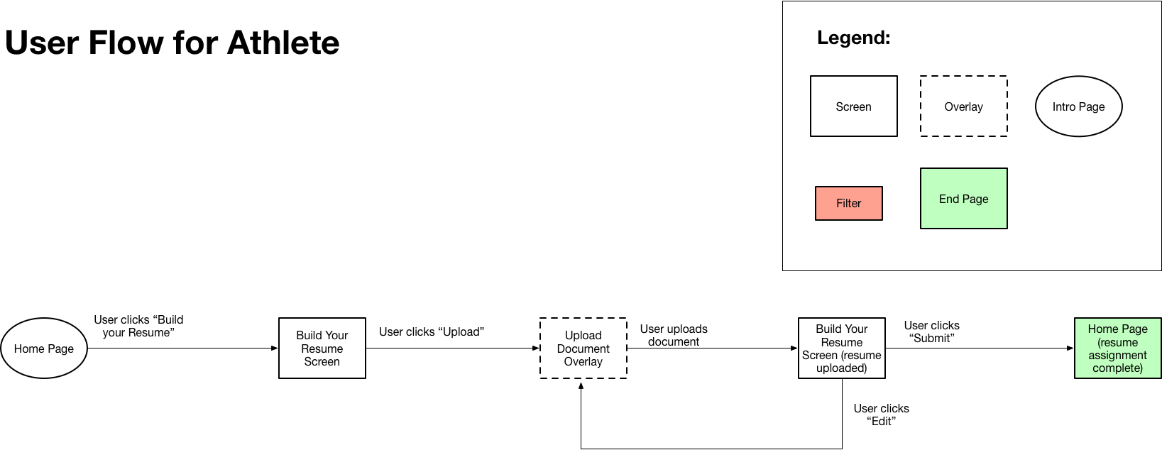
User Flows
After creating our site map, we created a user flow for both the career coach and athlete in order to visualize each step they would take while navigating the dashboard. This would give us a better idea of how to design our screens.
Career Coach:

Athlete:
Creating the Wireframes
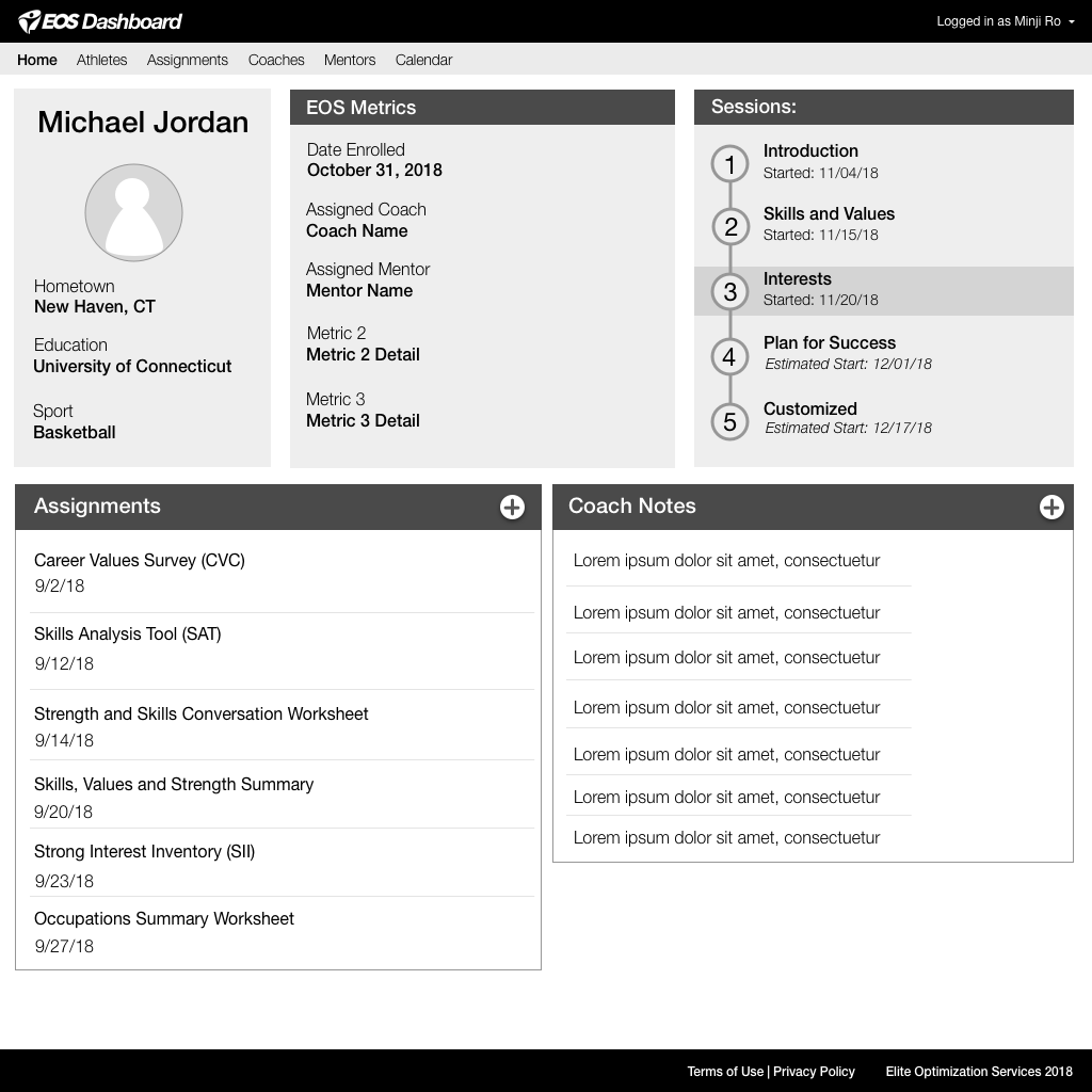
We started sketching low fidelity wireframes of 2 dashboards: one for the career coaches and one for the athletes. We began our sketches with pencil and paper in order to focus on the layout, then created mid fidelity wireframes on the computer so we could prepare them for a prototype.
Career Coach Main Page
Athlete Main Page
Assignments Page
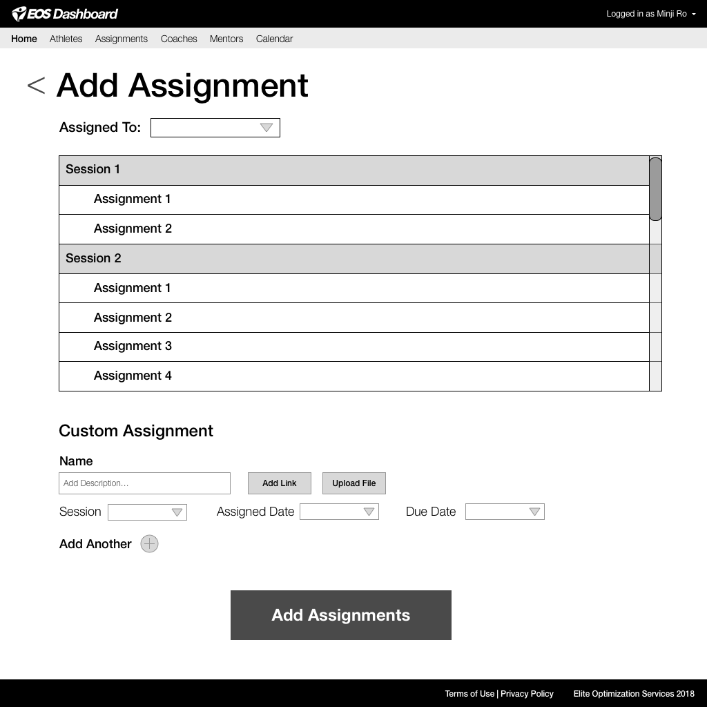
Add Assignment Page
Phase 4: Usability Testing
Once we completed our first draft of mid-fi wireframes, we compiled them into a prototype and performed three rounds of testing. During each round, we presented the user with a scenario and a few tasks. In addition to noting their feedback, we asked the users to rate the difficulty of their tasks with the prototype on a scale of 1 to 5 (1 being easiest and 5 being most difficult).
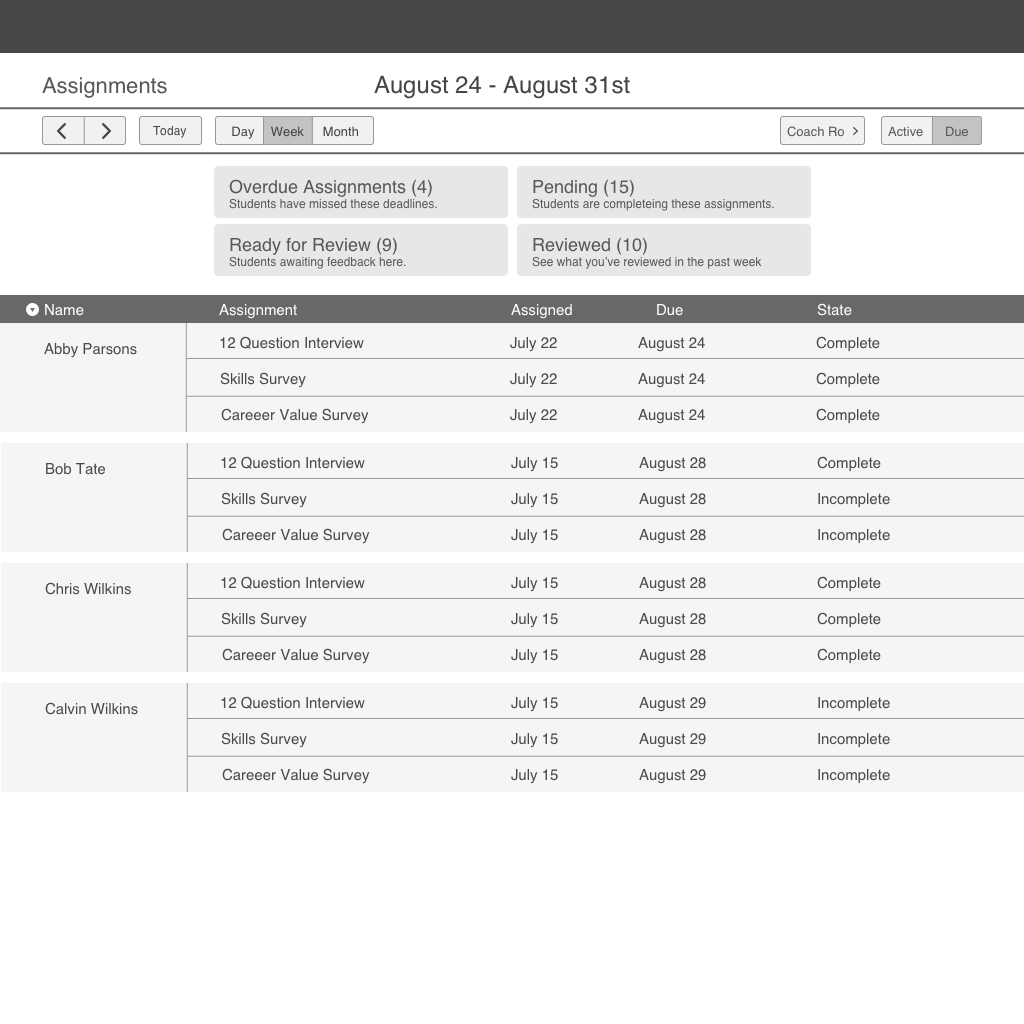
Assignments Page:
For the Assignments page in the career coach prototype, we wanted the career coach to be able to view all of his students' assignments. We gave the option to sort by name, and filter by assignments that are overdue, ready for review, pending, and reviewed.
Iteration 1:
- In our first iteration, we placed the dates at the top and allowed the coach to filter out assignments by choosing a day, week, month and shifting through using the arrow keys.
- Users could filter by assignment status with the grid at the top, however, they felt a slight awkwardness selecting tabs to filter assignments by reviewed, overdue, etc.
- Each assignment was listed by athlete, and labeled as “complete” or “incomplete”. Users could select an assignment by clicking on its completion status. Some users had difficulty figuring out how to select an assignment.
Iteration 2:
- We moved the dates to the left and placed the arrow buttons next it.
- We rearranged the filter buttons to more closely represent tabs. We also colored them to their corresponding tabs in a way to make them more obviously clickable. Users could understand the function of these buttons, but some users spent a few seconds interpreting what each tab meant.
- Some users still had difficulty figuring out how to select an assignment.
- We added a needed "Add Assignments" button in the top right corner.
Iteration 3:
- We added a needed "search" button next to the dates.
- We changed the completion status of each assignment to match the tab it would be listed under.
- We created clear, colored buttons for each assignment under "status".
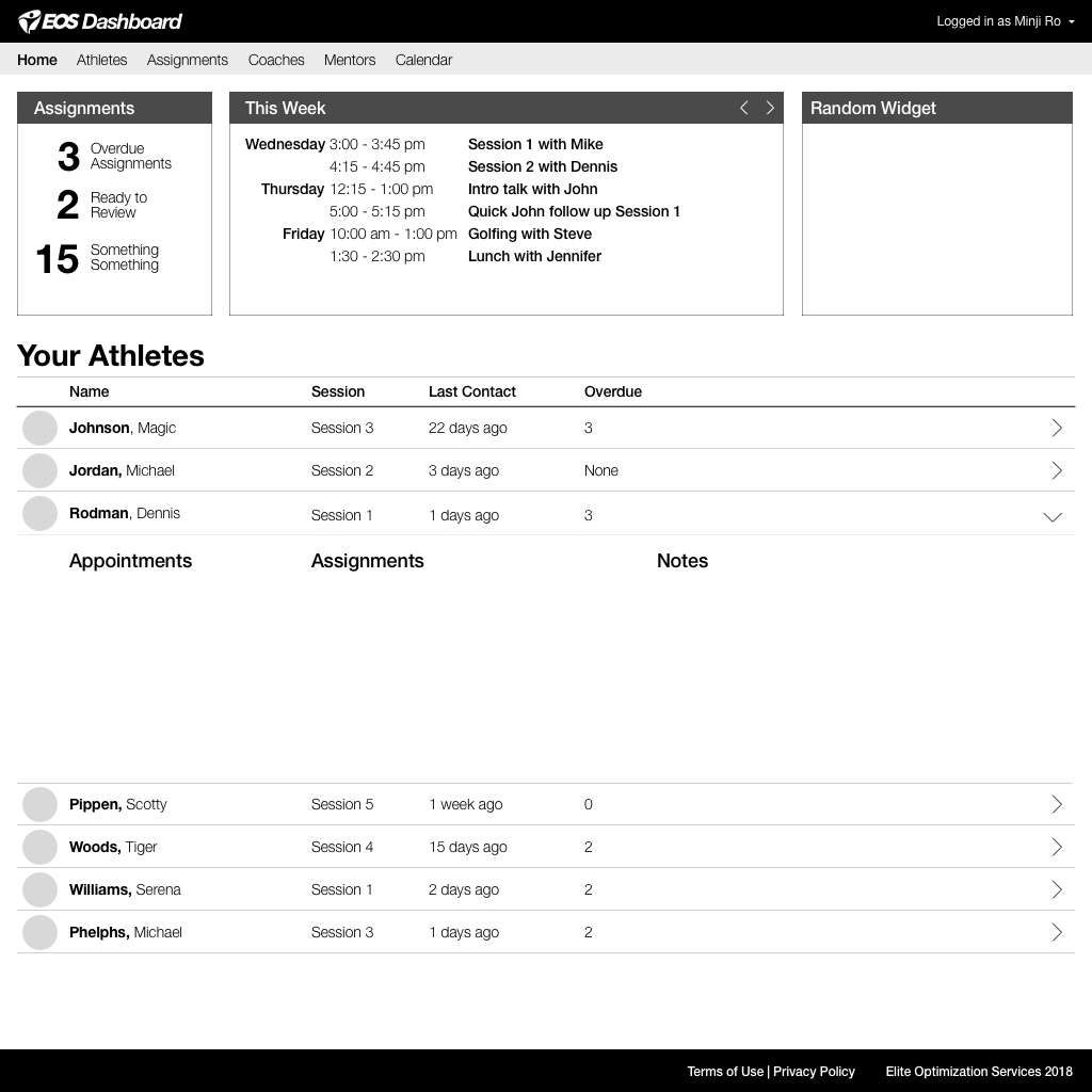
Main Page:
For the Main Page on the career coach's side, we wanted his to see all immediate important information, and then be able to navigate to a more in depth version of whichever information he was looking for.
Iteration 1:
- Users felt confused about which assignments to look for under the "Assignments" panel.
- Users felt awkward reading the "This Week" panel.
- "Random Widget" on top right took up space and users did not know how to use it.
Iteration 2:
- We rearranged the "This Week" Panel so days were listed horizontally instead of vertically. Users felt much more comfortable reading the panel this way.
- Some users felt confused about which assignments to look for under the "Assignments" panel. We hoped that adding color might clarify this panel, but we realized we might have to simplify it.
- We added the detail dropdown for each athlete. When arrows are clicked, the dropdown shows more details on the assignments, appointments, and notes for the athletes. Users were able to quickly understand this feature on the first try.
Iteration 3:
- We clarified the Assignments panel by simplifying the language. "Overdue" registers more easily than "Overdue Assignments.
Our final deliveries to the stakeholders included user flows, a sitemap, and annotated wireframes. The videos below give a guided experience through both the career coach and athlete dashboards.


